Textual Analysis
Intro:
In this task I was asked to annotate four front cover magazines and four double page spread including the denotation, mise-en-sence, target audience etc.
In this task I was asked to annotate four front cover magazines and four double page spread including the denotation, mise-en-sence, target audience etc.
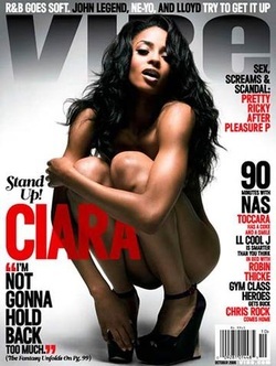
Denotation: This magazine captures a long shot of a female who bend down and nude. She has her arm crossed over her knees which covers her upper body. The models hair is long which then covers most of her shoulders, this shows seduction and sex appeal. There are also quotes and information surrounding the model, the font is in black and red colours, these two particular colours attract the target demographic because it stands out from the white background. There is also a title placed at the back from the models head, it's a big grey front that fades from the bottom and gets darker towards the top.
Mise-en-scene
Costume: She has black wedges with straps
Props: There are no props
Setting: White background. Big grey title. Big bold red and black font placed on the sides of the magazine.
Light: There is a big bright spotlight shining in the middle of the magazine to show off the model. The light then starts to fade within the corners of the magazine.
NVC: The model is bend down with her head slightly up looking towards the camera. She has her feet slighting tucked in towards her body. She also has her knees towards her chest and one of her arms crossed over her knees to cover her upper body part, while the other arm is reaching her right hills. Her facial expression shows her eyes looking down to the camera, which shows off her eye-makeup, also her mouth is half way open.
Colour: White, grey, black and red.
Target Audience: The target audience would preferably aimed at teenagers/young adults who listen to hip-hop or R&B. This front cover in particular would be aimed towards males because of model in the picture and its sex appeal.
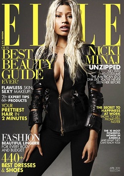
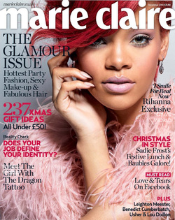
Denotation: This front cover magazine is a long shot, showing a model dressed in a black zipped coat, and trousers. The zip the model is wearing is half way between her stomach revealing the models cleavage, which shows sex appeal. The model is standing up with a strong straight posture. She is slightly leaning on her left leg. Her arms are by her sides. She is surrounded by yellow and white typography. The title is positioned at the back of the models head going across the top of the magazine in big and bold yellow font.
Mise-en-scene
Costume: Black zipped coat and black fitted trousers.
Props: No props used
Setting: Grey plain background.
Light: The lighting of the front cover is bright all over, it enhances the models face and body.
NVC: The model is positioned in the middle of the magazine, she is standing with her back straight looking directly towards the camera. Her face is very strong and fierce look, her hair covers most of her left side of her face.
Colour: Grey background. Yellow and white typography. Black clothing.
Target Audience: This would be aimed for young adults. Preferably for a female with expensive taste in high fashion.
Denotation: This is a fashion magazine. It has a close up of a female model, this is to show off her make-up; pink eye shadow and lipstick, and black mascara to brighten her eyes. She has her fringe swiped across her face almost covering her right eye. The title of the magazine is in a big white font, it is placed at the top of the magazine going across the models head. There is also black and dark pink typography surrounding the sides of the magazine.
Mise-en-scene
Costume: Fluffy pink clothing.
Props: Earrings.
Light: The light is very light from the background making the models face stand out more, also making the baby pink and her make up stand out.
NVC: The model is looking directly at the camera, she has a innocent and sweet look. her hand is positioned on her right side of her face, gently touching her cheek.
Colour: Baby blue background. White font. Dark pink and black typography. Red hair.
Target Audience: This would be aimed for females who are into modern fashion clothing and cosmetics.
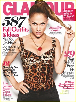
Denotation: This is a magazine of fashion clothing, it's captured of a model standing up straight, with her right hand placed on her hip and the left hand holding the end of her ponytail. This is of a mid shot showing the the model from the waist up. She has a leopard print top on and some tightly fitted trousers, her facial expression is a very serious, strong and fierce look, showing she is a strong and dominant female, she is also looking directly at the camera with her head slightly down. There is also the title placed at the back of the models head going across, it also has different typography surrounding the model, many placed either in front or behind the model.
Mise-en-scene
Costume: Leopard print top, black trousers
Props: Earrings, necklace.
Setting: white background
NVC: The models posture is very straight and stiff, she has her hand placed on the side of her hip while the other hand is holding the end of her ponytail, by doing this shows femininity. However, her facial expression is very strong and fierce and by this shows dominance and seduction.
Colour: Black, white, pink, grey, dark brown and light brown.
Target Audience: This would be aimed towards female adults, who like fashion clothing and cosmetics, also interesting information about make up, beauty, clothes etc.
Typography: The text within this double page spread is laid out in paragraphs which makes the magazine look more tidy and organised. It also has one paragraph in pink font so it can stand out and catch the audience's eye. The pink font also carries on with the theme of feminism showing that the target audience for this magazine would be mainly aimed at females. There is a title under each paragraph which helps the reader to stay focused when reading.
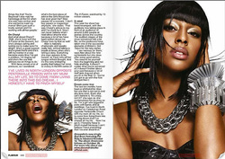
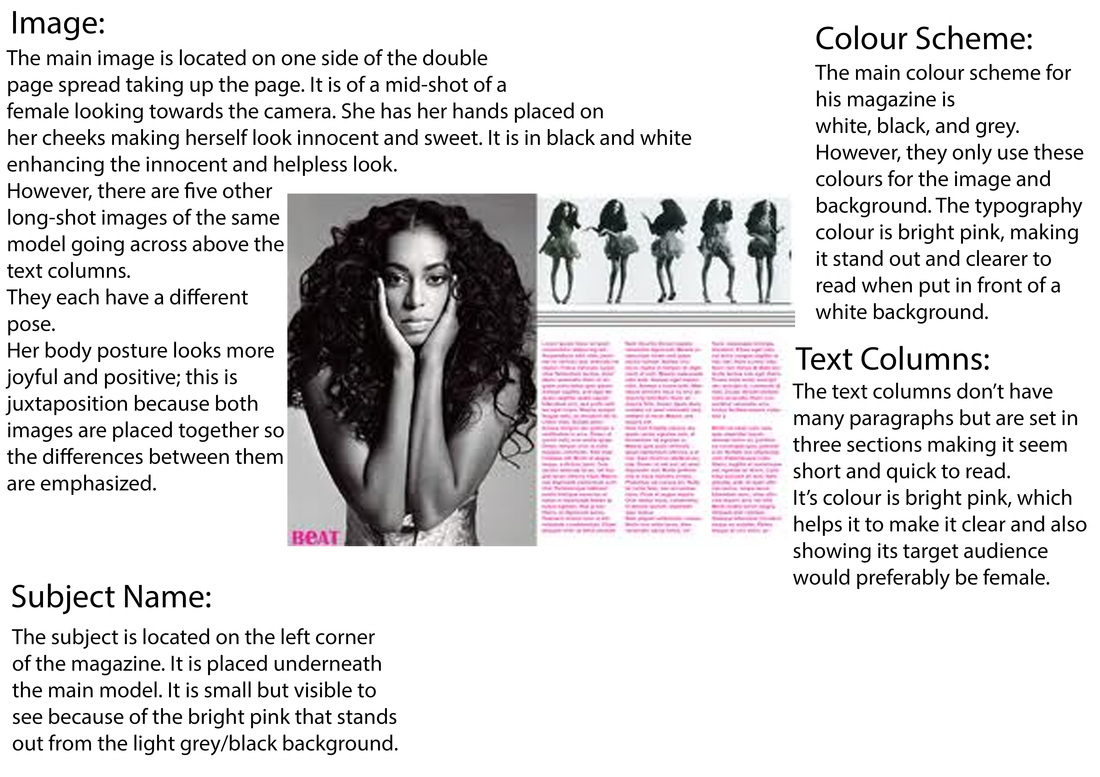
Denotation: There is two pictures of the same model in this double page spread. On the right is a big close up of the model posing directly towards the camera, towards the left side of the magazine is a different picture with the same model but it's more minimized. By having a different pose in the two pictures can show the two different personality the model has and could also show what the magazine is based on.
Mise-en-scene
Costume: Black strapped top. Silva necklace and bracelets.
Props:
Setting: It is of a plain white background. Its split between the middle, one side which consist's a big picture of the model, the other side which consist's of another small photo of the model including the information and text surrounding neatly around the model.
Light: It is bright all over the magazine, the white background and light clash together creating it a brighter effect. This helps show the black and pink text clearly.
NVC: On the picture in the right, it's a close up of the model with her head slightly tilted up looking down towards the camera, she has both hands placed on her hair. She looks very calm and relaxed in this photo. However, the smaller photo on the left is a close up of the model with her eyes closed, with her head facing upwards, she has her hands placed much higher in her hair. Her mouth is wide open and her hair looks like its blowing upwards. This photo shows more fun and excited side of the model.
Colour: White background, black clothes and text, pink text, Silva jewelry.
Target Audience: This would preferably aimed towards young adults, mainly female.
Typography: This double page spread contains variety of paragraphs surrounding the sides of the magazine, it is on both pages, and in grey font. There are also two text in yellow.
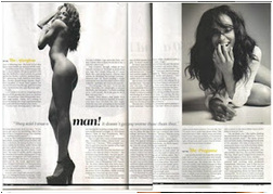
Denotation: This is a double page spread that consists with two photos, on the right there is a photo of a model laying down looking towards the camera. The other photo on the left is of a long shot of the model on her side, nude. Surrounding that photo is four paragraphs of information. The other information is on the other page underneath the photo on the right. By reading the headings going across shows it is written in first person which gives us an idea on what the magazine would be about.
Mise-en-scene
Costume: High heels, white top.
Props:
Light: The whole magazine page is bright apart from the two photos of the model which is in the colours, black, grey and white.
NVC: The photo on the right shows the model laying down on her side facing towards the camera, she has her left hand placed in front of her mouth, which shows she is smiling/laughing. She looks very relaxed and happy in this picture showing positivity.
Colour: White, black, grey and yellow.
Target Audience: This would be aimed towards females who are a fan base of this particular artist or someone who likes this genre of music (R&B). It could also be aimed towards males by the images included in this magazine e.g. sex appeal.
Typography: There is a lot of information within this magazine, the text is neatly written in two columns. It is in black font. It doesnt really stand out much becuase it is in all the same size and colour, however, there are two big captial letters in two seperate paragraphs which stand out the most. It also has a red big 'J' in between the two columns of information.
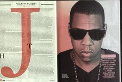
Denotation: This is a double page spread about an American rapper artist, Jay Z. It is split in half with one close up photo of the artist and the other half of the page consisting with information about the artist. It also has the title on the top in small.
Mise-en-scene
Costume: Balck top, glasses, necklace.
Props:
Setting:
Light: The lighting is not bright but it is clear due to the white background and black font, however, in the picture the colour is split in two, half of the artist's face is red and the other half is white.
NVC: The artist looks like he is looking straight at the camera because he has his face towards the front, but becuase of the glasses it doesnt show if he is looking directly at the camera. He's facial expression doesn't say much, it is quite serious almost looking like he is focusing on something.
Colour: White, red, black.
Target Audience: This would appeal to young males who like this genre of music or the artist and would like to know more about this artist.
Typography: This is also similar to the jay z double page spread, it is laid out in three columns with lots of information. It is in black text with one big capital letter from the top corner of the text. It also has the title and headings above the inforamtion with a different colour text.
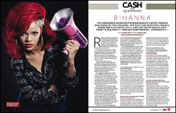
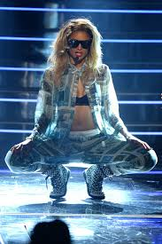
Denotation: This double page spread is about the R&B artist Rihanna, I know this becuase at the top my right hand side has in pink and capital letters the artists name, 'RIHANNA. Above that has another heading in black bold text saying, 'CASH FOR QUESTIONS, by this title it already gives you an idea of what the magazine is going to be about. On the left hand side shows a mid shot of the artist looking towards the camera with a fierce and strong look, the way she is positioned herself with her arms folded leaning almost towards the camera shows she is an agressive character.
Mise-en-scene
Costume: Blue and glitter zipped jumper, gold hoop earrings, flower placed on the side of her hair.
Props: horn microphone.
Setting: The background on the left side is plain black which enhances the models features more. The background on the right side which consists of the main writing and information is plain white so it makes it easier for the reader to see the text clearly.
Light:
NVC: The artist is looking directly towards the camera with a fierce and strong look, almost slightly bowing her head down. Her body langauge is of her leaning slightly foward towards the camera, she has her right arm crossed over her stomach and the same hand tucked underneath her left armpit which shows dominance and aggressiveness.
Colour: Dark blue, red, purple, pink, black and gold.
Target Audience: This would be aimed at females who are interested in this particular artist.
Conventions Diagrams
Intro:
In this task I was asked to analyse one front cover, contents, and double page spread magazine. Focusing on the colour, main image, denotation, title, sub-lines etc.
In this task I was asked to analyse one front cover, contents, and double page spread magazine. Focusing on the colour, main image, denotation, title, sub-lines etc.
Audience Research
Questions
For this page I will be finding out what the audience would like in a music magazine, by doing this I will be asking 20 questions to 20 people and will see what the results are. By finding my information I will be asking people through whatsapp, Facebook, twitter, any social networking site. I could also make my very own survey to find my results quicker.
1. What's your gender
Font A
Font B
Font C
Font D
Font E
Font F
For this page I will be finding out what the audience would like in a music magazine, by doing this I will be asking 20 questions to 20 people and will see what the results are. By finding my information I will be asking people through whatsapp, Facebook, twitter, any social networking site. I could also make my very own survey to find my results quicker.
1. What's your gender
- Female
- Male
- Other
- 13-15
- 16-18
- 18+
- Top
- Middle
- Bottom
- Diagonal
- Buzz
- 300
- The Flow
- Magnet
- £1.00
- £1.50
- £2.00
- £2.50
- £3.00
- £3.50
- £4.00
- Yes
- No
- Sometimes
- No
- If Yes. Why? ________________________
- Yes
- No
Font A
Font B
Font C
Font D
Font E
Font F
10. Do you prefer a magazine to be:
A. Messy - more crowded with images and text
B. More organised and neat
11. Would you prefer the mode of address to be:
A. More formal and intellectually written
B. Informal with more chatty tone
12. What type of artists would appeal to you on the front cover:
A. Messy - more crowded with images and text
B. More organised and neat
11. Would you prefer the mode of address to be:
A. More formal and intellectually written
B. Informal with more chatty tone
12. What type of artists would appeal to you on the front cover:
- Establishing artists
- Upcoming artists
- A mixture of both
A. Long Shot ------->
B. Mid Shot -------->
C. Close Up -------->
14. What do you feel makes a good magazine?
______________________________________________
15. How often do you buy music magazines?
______________________________________________
15. How often do you buy music magazines?
- Weekly
- Fortnightly
- Monthly
- Sometimes
- Rarely
- Other
Ciara ??????????
J. Cole ?????????
Azealia Banks ?????????
Kanye West ????????
17. What genre of music do you prefer?
18. How often do you listen to music?
19. How do you usually listen to music?
20. What would you like to see more of in a magazine?
- Pop
- Rock
- Hip hop & RnB
- Classical
- Dance
- Garage
- Folk
- RnB
- Jazz
18. How often do you listen to music?
- Everyday
- Every few weeks
- Not that much
- Never
19. How do you usually listen to music?
- Ipod
- Phone
- Itunes
- Radio
- TV
20. What would you like to see more of in a magazine?
- Posters
- Photo shoots
- Gossip
- New music
- Concert reviews
First question: 14 females and 6 males answered, showing that mainly females are more interested in music magazines than males.
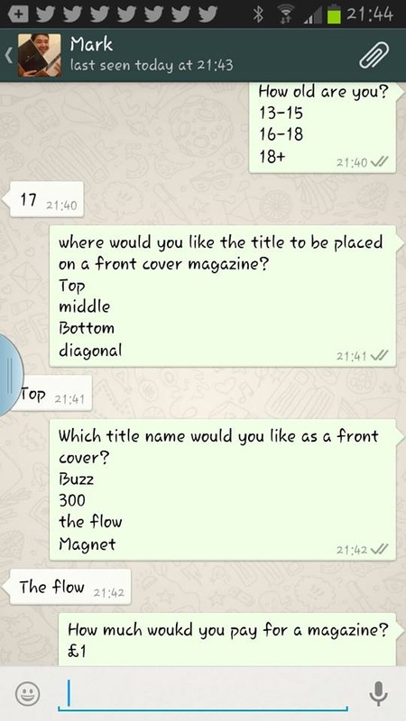
Second question: All the people who answered were all between the ages of 16-18 showing exactly what age group music magazines are aimed to.
Third question: 60% Said they would like the title to be placed at the top, 40% said they would prefer the title to be diagonal, and the rest would prefer the title to be in the middle of the magazine.
Fourth question: 9 people said they would prefer the title name for a front cover to be 'The Flow'. 5 people said they would prefer it to be called 'Magnet'. 6 people said they would prefer the title to be called '300'. No one wanted a title for a front cover magazine to be called 'Buzz'.
Fifth question: 80% said they're willing to pay £2.50 or less, 20% said they're willing to pay £3.00 or more.
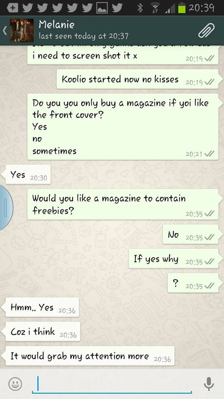
Sixth question: 12 people said that they wouldn't buy a magazine if they disliked the front cover magazine or if it was not up to quality standard. 7 people said they would sometimes buy a magazine if they liked the front cover magazine. 1 person said they don't buy a magazine based on the look of its front cover.
Seventh question: All people that answered said they would like a magazine to contain freebies some of the reasons are:
Ninth question: 8 people liked font D. 4 people liked font F. 6 people liked font E. And only 2 people liked font A.
Tenth question: 90% said they'd prefer a magazine to be messy more crowded with images and text. 10% said they'd like a magazine to be more organised and neat.
Eleventh question: 100% said they'd prefer the mode of address to be informal with a more chatty tone.
Twelfth question: 75% said mixture of both, 10% said upcoming artists. 15% said establishing artists.
Thirteenth question: 5 people said they'd prefer long shot. 12 people said they'd prefer mid shot. 3 people said they'd prefer close up.
Fourteenth question: Some of the responses:
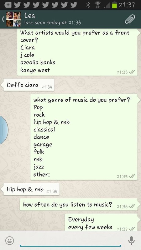
Sixteenth question: 8 people said Ciara. 3 people said J. Cole. 6 people said Kanye West. 3 people said Azealia Banks.
Seventeenth question: 60% said Hip-Hop & RnB. 20% said Pop. 20% said just RnB.
Eighteenth question: 18 people said they listen to music everyday. 2 people said they listen to music every few days.
Nineteenth question: 16 people listen to their music on their phone. 4 people said they listen to their music on their iPod.
Twentieth question: 75% said they would like to see gossip in a magazine. 10% would like to see the latest music out in a magazine. 15% said they would like to see posters.
Second question: All the people who answered were all between the ages of 16-18 showing exactly what age group music magazines are aimed to.
Third question: 60% Said they would like the title to be placed at the top, 40% said they would prefer the title to be diagonal, and the rest would prefer the title to be in the middle of the magazine.
Fourth question: 9 people said they would prefer the title name for a front cover to be 'The Flow'. 5 people said they would prefer it to be called 'Magnet'. 6 people said they would prefer the title to be called '300'. No one wanted a title for a front cover magazine to be called 'Buzz'.
Fifth question: 80% said they're willing to pay £2.50 or less, 20% said they're willing to pay £3.00 or more.
Sixth question: 12 people said that they wouldn't buy a magazine if they disliked the front cover magazine or if it was not up to quality standard. 7 people said they would sometimes buy a magazine if they liked the front cover magazine. 1 person said they don't buy a magazine based on the look of its front cover.
Seventh question: All people that answered said they would like a magazine to contain freebies some of the reasons are:
- Wanting them to buy the magazine more often.
- it grabs their attention more.
- it also keeps them satisfied and happy.
Ninth question: 8 people liked font D. 4 people liked font F. 6 people liked font E. And only 2 people liked font A.
Tenth question: 90% said they'd prefer a magazine to be messy more crowded with images and text. 10% said they'd like a magazine to be more organised and neat.
Eleventh question: 100% said they'd prefer the mode of address to be informal with a more chatty tone.
Twelfth question: 75% said mixture of both, 10% said upcoming artists. 15% said establishing artists.
Thirteenth question: 5 people said they'd prefer long shot. 12 people said they'd prefer mid shot. 3 people said they'd prefer close up.
Fourteenth question: Some of the responses:
- Consists of a eye catching front cover.
- Gossip within the magazine is interesting and intriguing.
- Articles short but interesting along with good use of images.
- Good use of images.
Sixteenth question: 8 people said Ciara. 3 people said J. Cole. 6 people said Kanye West. 3 people said Azealia Banks.
Seventeenth question: 60% said Hip-Hop & RnB. 20% said Pop. 20% said just RnB.
Eighteenth question: 18 people said they listen to music everyday. 2 people said they listen to music every few days.
Nineteenth question: 16 people listen to their music on their phone. 4 people said they listen to their music on their iPod.
Twentieth question: 75% said they would like to see gossip in a magazine. 10% would like to see the latest music out in a magazine. 15% said they would like to see posters.
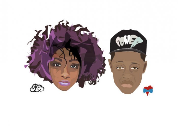
Profiling Your Audience
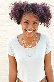
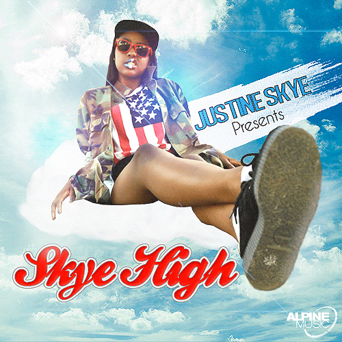
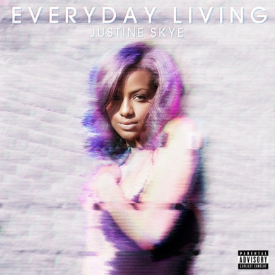
Justine Skye was born to parents of Jamaican
decent on August 24th, 1995.
She loves singing, and writing her own songs.
She likes to listen to all types of music but mainly listens to R&B.
She became well known on a blogging social networking site called tumblr, and from that she began posting pictures, videos, and her mix-tape (Skye High) which gained recognition.
She has a natural God given talent, stunning good looks, bubbly personality and a
daring sense of adventure, and is on the fast
track to success. At only 17 years of age,
this Brooklyn born singer/songwriter lives a
double life as a carefree teenager during the
day and superstar in training by
night.
April 20th, 2012 marked the release of Justine’s mixtape “Skye High” which has over 50,000 views on highly acclaimed Mixtape site DatPiff.com and was recognized as Mixtape of the Week. Justine Skye is currently working on her debut album.
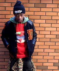
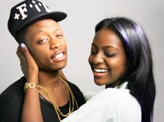
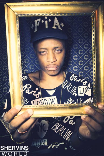
Name: Glyn Brown
Born: May 23, 1993 (age 20)
Bronx, New York, United States
Nationality: Jamaican and British
Education: Parsons The New School for Design.
Occupation: Fashion designer
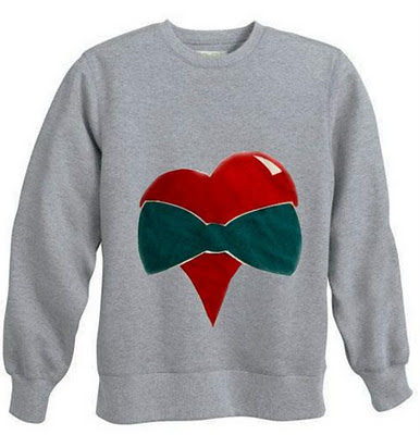
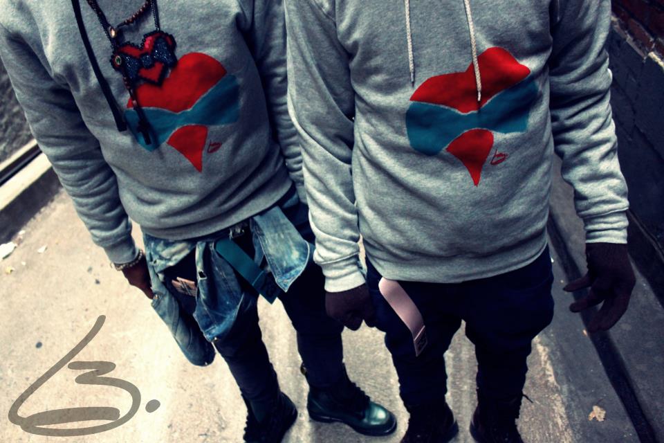
Labels: L3NF(LoveNFashion)
Some Facts:
Likes hanging out with friends
Creates tumblr meet-ups
Loves fashion and design.
Likes to listen to Hip-Hop, R&B, and Rap
He began designing his line at the age of 16-17 and studies at the Parsons The New School for Design in New York City. In 2011, Brown launched his L3NF brand. Building on his success from hand making and selling pins, Brown has earned a spot in the fashion industry and was collaborated with Nike Sportswear on July 24th 2012, to showcase their 40th anniversary and release their new Niki Digi Camo AF1 sneakers along side musician Theophilus London.
Born: May 23, 1993 (age 20)
Bronx, New York, United States
Nationality: Jamaican and British
Education: Parsons The New School for Design.
Occupation: Fashion designer
Labels: L3NF(LoveNFashion)
Some Facts:
Likes hanging out with friends
Creates tumblr meet-ups
Loves fashion and design.
Likes to listen to Hip-Hop, R&B, and Rap
He began designing his line at the age of 16-17 and studies at the Parsons The New School for Design in New York City. In 2011, Brown launched his L3NF brand. Building on his success from hand making and selling pins, Brown has earned a spot in the fashion industry and was collaborated with Nike Sportswear on July 24th 2012, to showcase their 40th anniversary and release their new Niki Digi Camo AF1 sneakers along side musician Theophilus London.